The Artist Project
A brand-first digital foundation for a Canadian-based artist, designed to feel warm, intentional, and professional while letting the artwork lead.


At A GlanceLed brand discovery to define direction, goals, and audience
Developed a custom brand identity including color palette and typography
Created a comprehensive brand guide and brand essence document
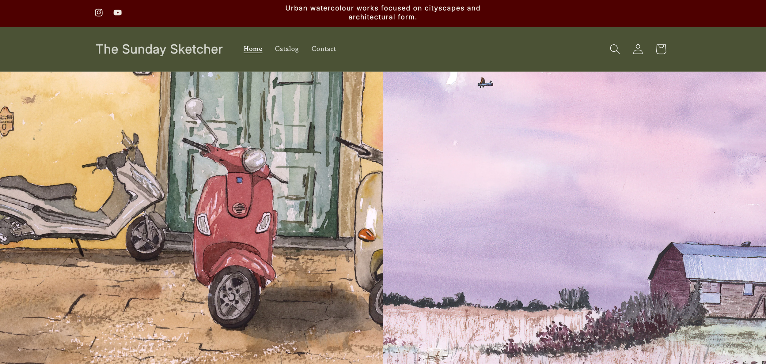
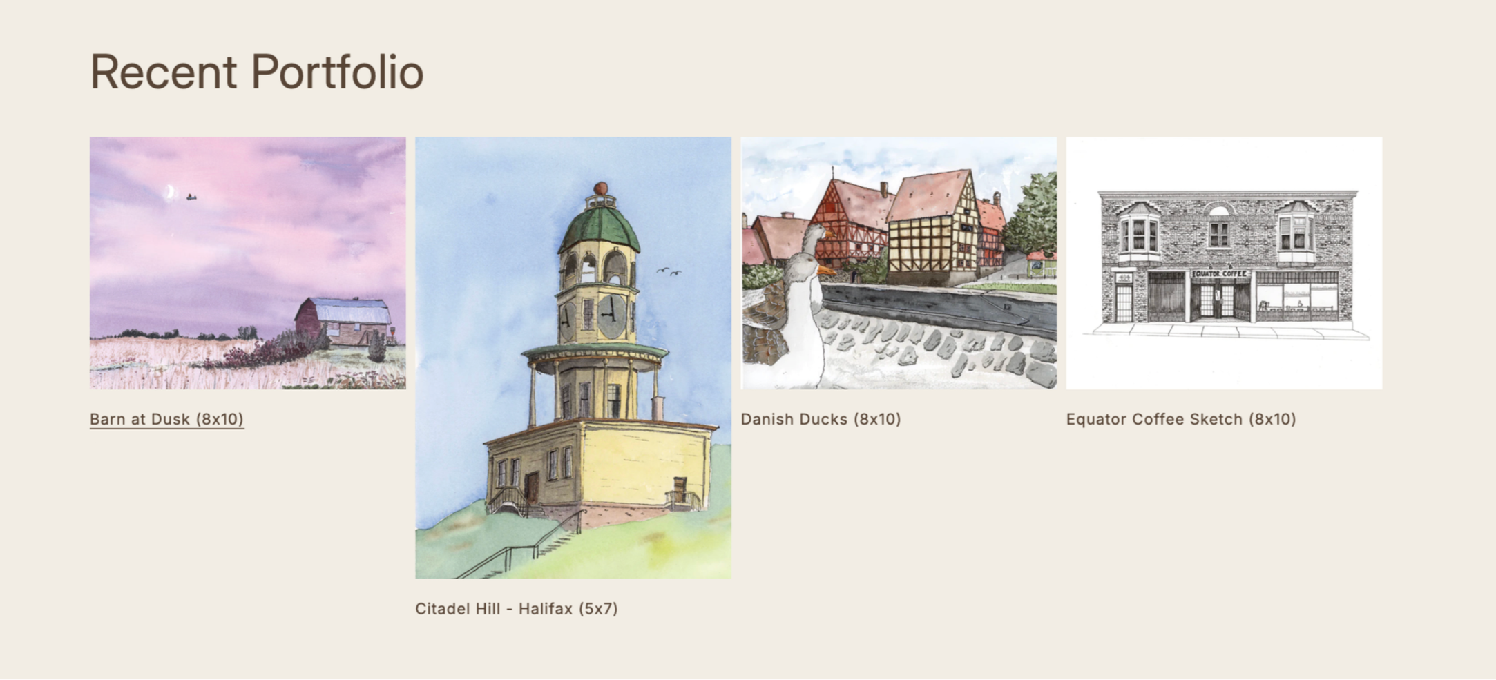
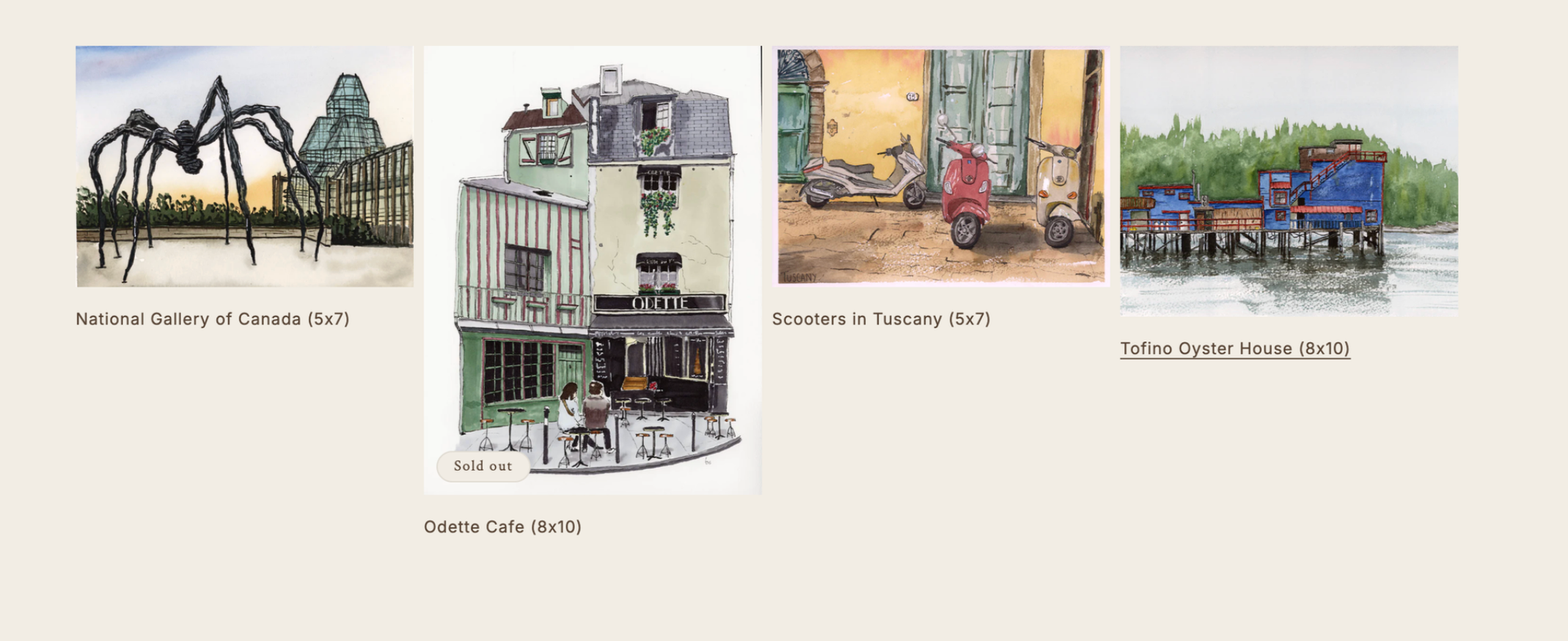
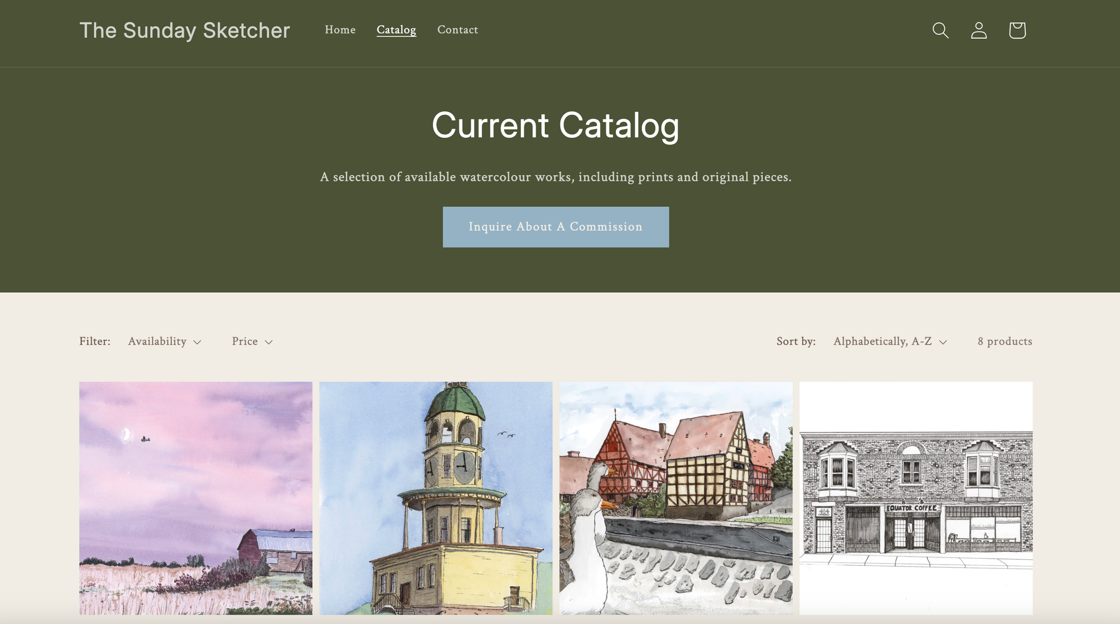
Designed a clean, artwork-led Shopify website focused on clarity and warmth
Optimized pathways for print sales and commission inquiries
Updated copy, footer, and social links to support community growth
Full Case StudyThe Artist Project
The Sunday Sketcher is a Canadian-based artist in Ottawa who was looking to move beyond simply showcasing artwork online and begin building a cohesive brand foundation for his creative practice.
While he already had an existing website and an active presence on Instagram and YouTube, the focus had always been on sharing work as it was created. The goal of this project was to establish a clear brand identity and digital home that felt professional, warm, and intentional — while allowing the artwork itself to remain the focal point.
The project began with a discovery call to define the brand’s essence, direction, and long-term goals. We discussed audience, tone, commission expectations, and how the artist wanted people to feel when engaging with his work online. From this conversation, I developed a mood board with multiple visual directions, which we refined collaboratively until the overall tone felt aligned.
From there, I created a custom brand guide to establish consistency across the website and future touchpoints. This included a fully customized color palette and typography system designed to feel clean, simple, and humble — intentionally understated so the artwork could take center stage without visual distraction.
Building on this foundation, I developed a detailed brand essence document to guide both creative and strategic decisions. This document outlined the brand’s audience, emotional goals, commission structure, visual direction, language guidelines, and key priorities for the website. A strong emphasis was placed on how the site should feel — calm, welcoming, and personal — reinforcing the idea that branding is as muchabout experience as it is about visuals.
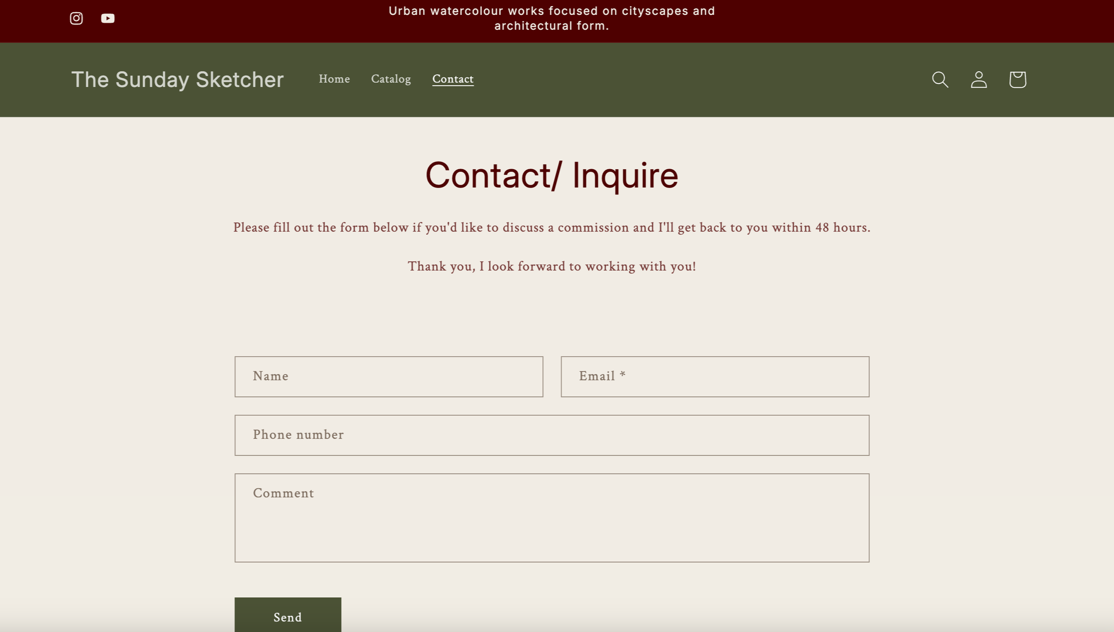
The website was then redesigned on Shopify with a minimal, artwork-led approach. I applied the new brand colors, typography, and themes across the site and introduced clearer structure and hierarchy. An “About the Work” section was added to provide context around the artist’s practice, while commission calls-to-action were surfaced throughout the site to make it clear how potential clients could request custom work.
Previously, commission inquiries were only accessible through a generic contact page. I clarified this flow by adding intentional language and buttons in multiple areas, ensuring visitors understood both the availability and process for commissions. The footer was also updated to include email signups for new releases and updates, supporting long-term audience growth.
To further strengthen the artist’s community, I integrated links to his Instagram and YouTube channels, allowing visitors to connect more deeply with the person behind the work and engage with content beyond the website. Finally, all website copy was refined to align with the established brand voice — warm, professional, and approachable.
The result is a cohesive brand and digital presence that supports both creative expression and business growth, giving the artist a clear foundation to evolve, sell work, and connect with his audience over time.