

SquarespaceSoma Movement Studio
Web Design & Restructure
A holistic movement studio built around movement, recovery, and clinical care - reimagined online to feel as clear and grounded as the practice itself.
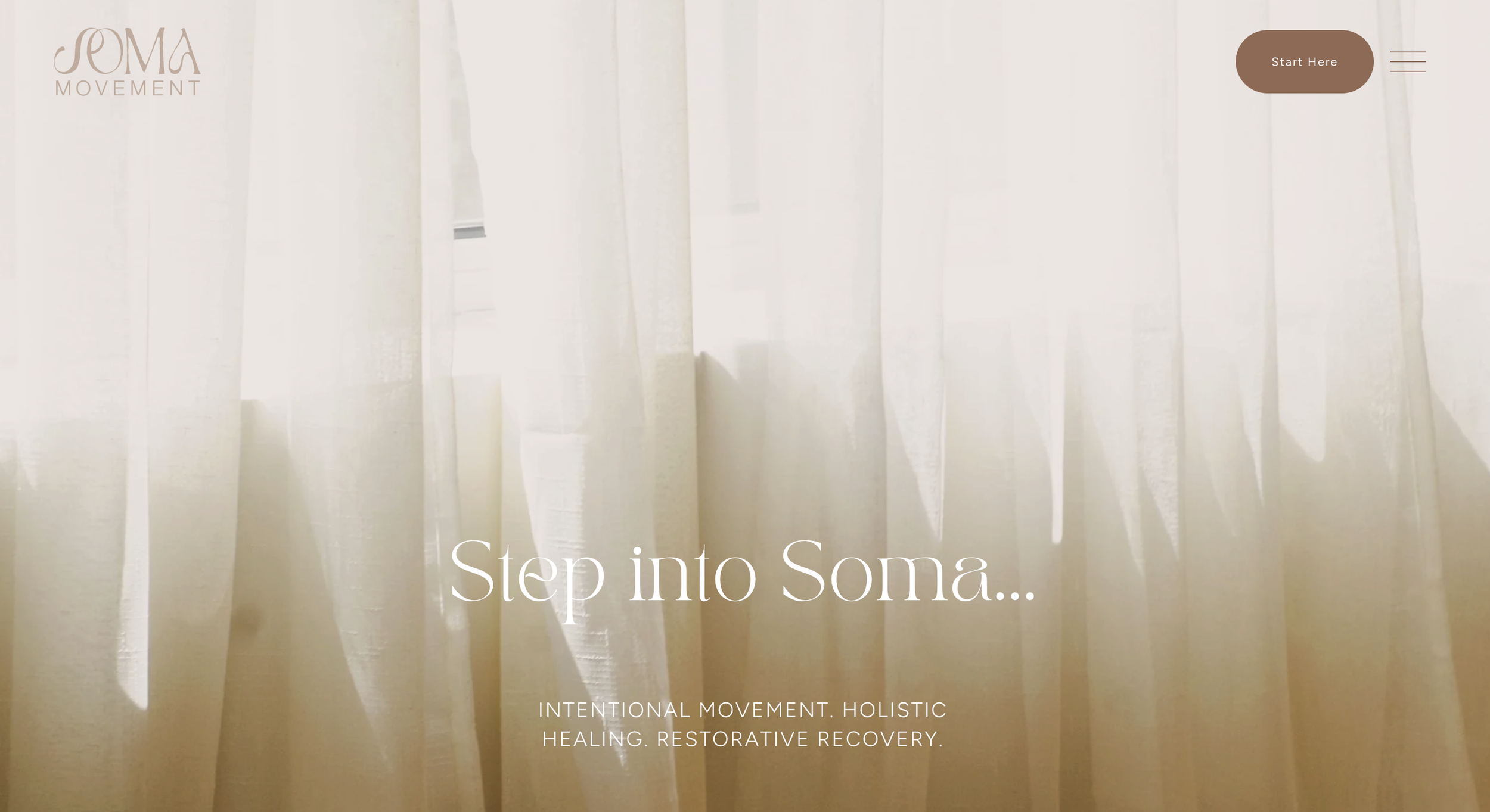

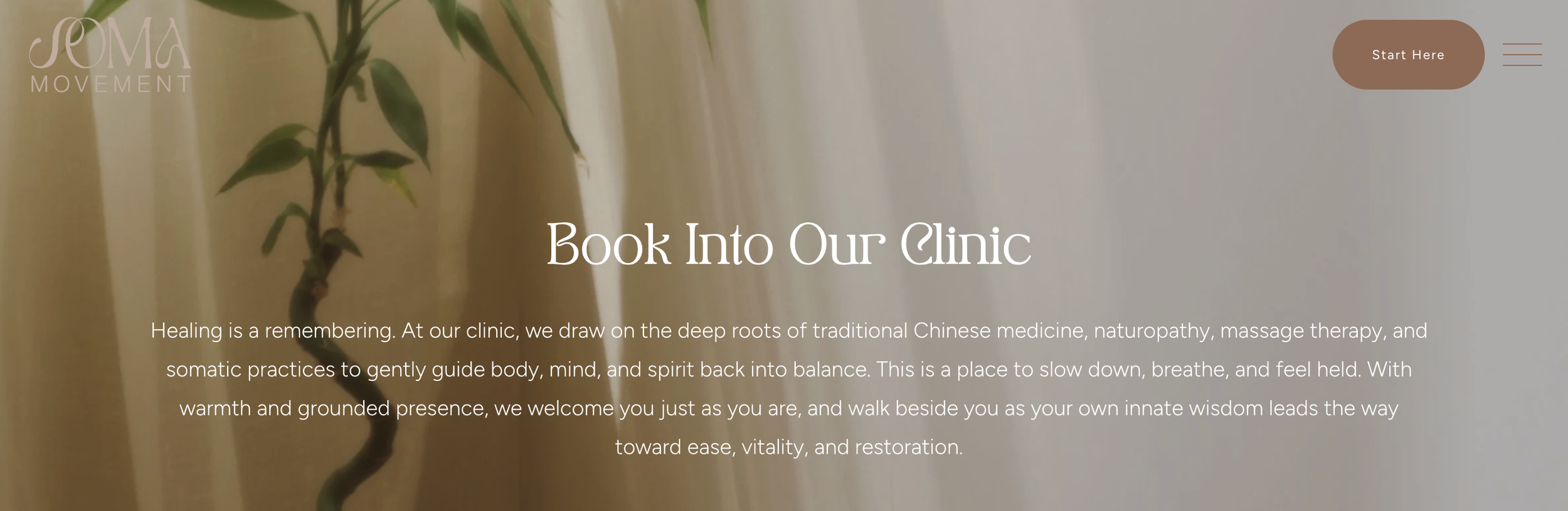
Directed a full website restructure on Squarespace, redesigning information architecture around user intent
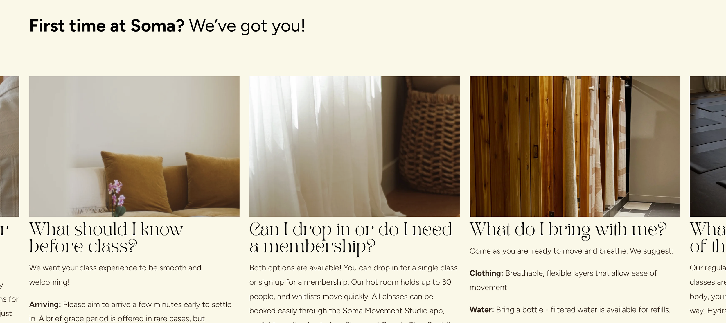
Rebuilt UX copy and FAQ content from direct customer feedback through voice-of-customer research
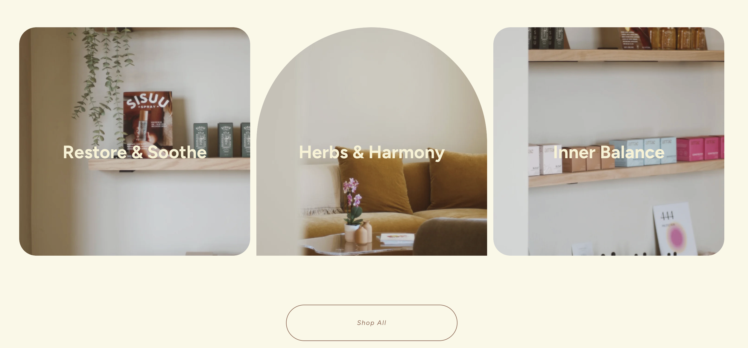
Directed photography strategy, replacing stock imagery with custom and real studio photography
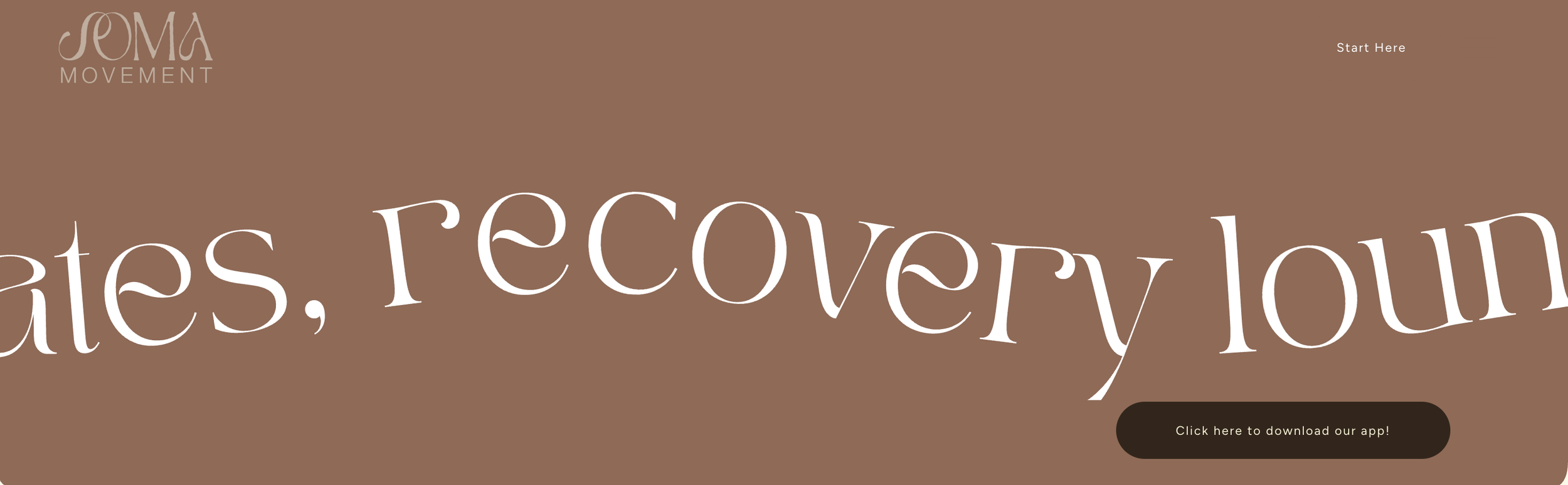
Designed scroll-based interactions and custom visual dividers to reflect the brand's movement-led concept
Refined colour palette for accessibility, contrast, and cross-page cohesion
Led technical integration and customization of the Jane booking system, aligning third-party software with brand visual identity
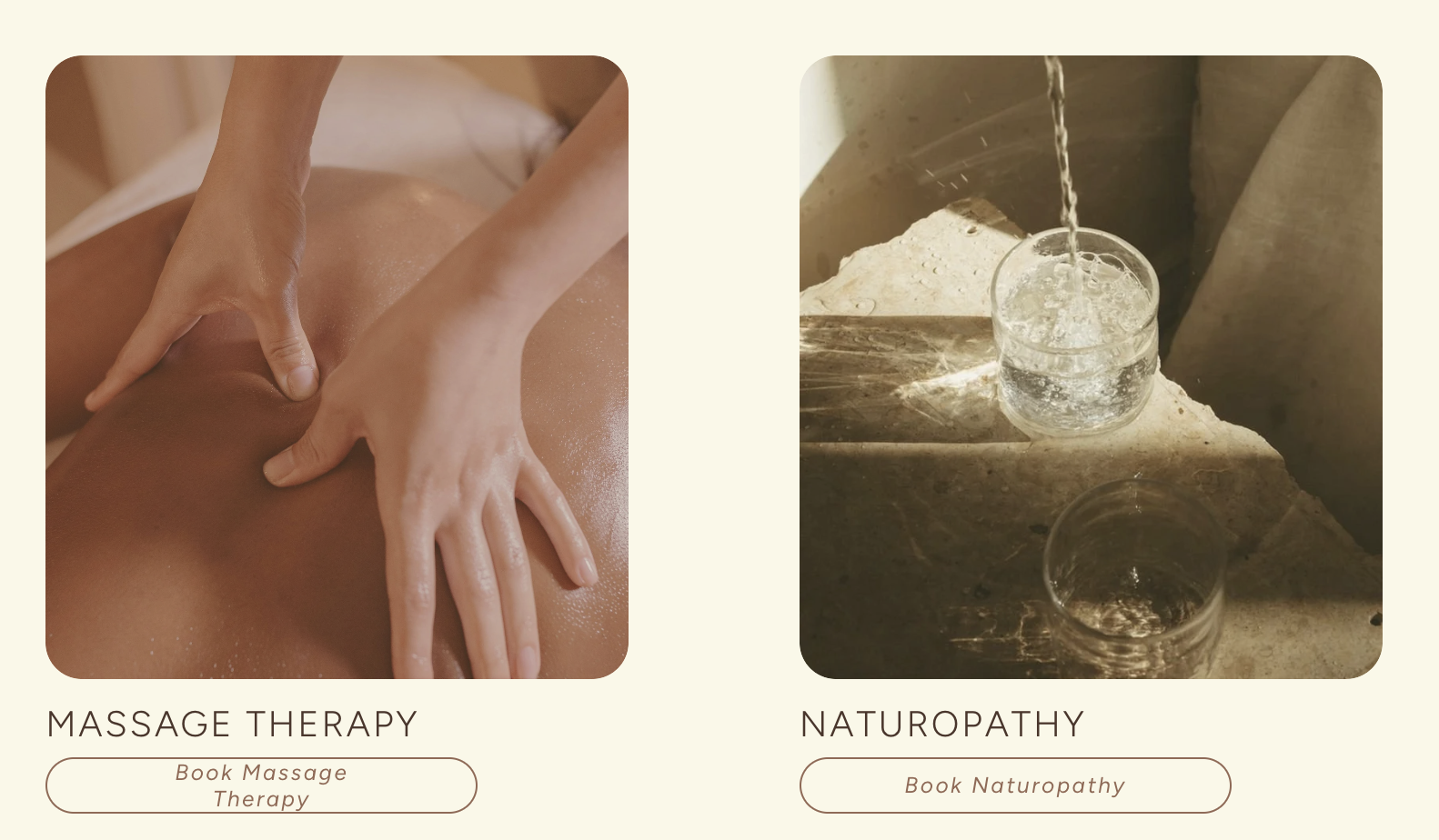
Restructured service offerings into clear categories, improving booking UX across web, app, and third-party platforms
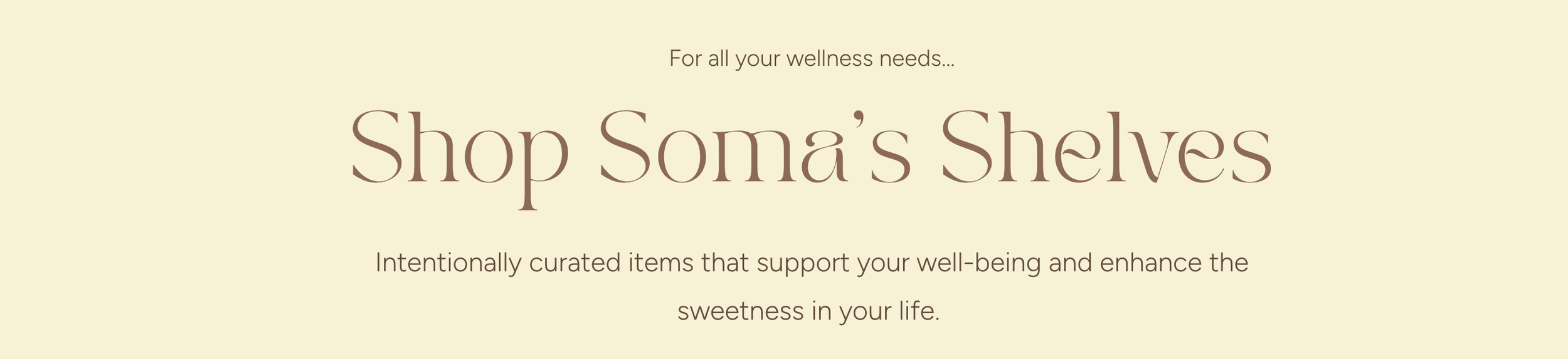
Designed and launched new revenue-generating pages, including a retail boutique and cross-linked sister-brand site
At A GlanceFull Case StudyThe Evolution of Soma Movement Studio
The opportunity
The existing site leaned on stock imagery and fragmented navigation, which made it hard for new and returning clients to know where to start. The calm, fluid experience of the physical studio wasn't translating online; clients were falling back on email just to understand offerings, memberships, and how to book. That gap, between an in-person practice built on ease and a website that created friction, was the real problem.
The concept
Soma sits at an intersection that's easy to get wrong - clinical precision (recovery, clinic services) alongside holistic, embodied care (movement, community). The site needed to hold both without either one undercutting the other: grounded enough to feel credible as a clinical space, warm enough to still feel like an extension of the studio's philosophy rather than a brochure sitting apart from it.
The process
Rebuilding started with information hierarchy; reorganizing navigation around user intent so offerings, memberships, FAQs, and booking surfaced early instead of requiring a hunt. The FAQ was rebuilt entirely from real community feedback rather than assumptions about what people would ask, addressing the actual points of confusion (arrival, bookings, memberships, what to expect first-time) that had been generating email inquiries in the first place.
The execution
Real studio and custom photography replaced stock images throughout, and scroll-based interactions and organic dividers were built in specifically to echo the physical sensation of movement; the site itself needed to move the way the practice does, not just describe it. Booking was the highest-friction point in the old site, so it became the highest-priority fix: a full transition to the Jane booking system, customized to the brand, with pathways designed across web, app, and third-party platforms so a client could book however was easiest for them, not however was easiest to build.
The result
Offerings were restructured into movement, recovery, and clinic as distinct categories, separated clearly from workshops and events, so choosing became simpler rather than requiring existing knowledge of the studio. A retail boutique page and a dedicated, clearly linked page for sister studio Movement Reformer rounded out the site; new revenue paths that also reduced confusion rather than adding to it.